 Students live in a media rich world where being able to present information clearly, succinctly and visually is a skill they will need to develop.
Four simple principles of design – Contrast, Alignment, Repetition & Proximity – can have a significant impact on the quality of visual work, both for teachers and students.
By explicitly teaching these principles, we can communicate more effectively to a range of audiences, and create meaningful, appealing content.
Videos for CARP can be found embedded in my eBook Design Secrets Revealed – available free from the iTunes Bookstore.
Download the keynote template on your iPad to explore as we move through the design principles.

Contrast
The use of contrast makes visuals stand out. Experiment with contrasting size, colour, shape and proximity on the Keynote template.
Alignment
The process of lining up objects and text. Things that line up feel right. A grid can help you line up your work (as can the alignment guides in Keynote). Left-aligned text is easiest to read, as your eye returns to the same place each time.
Repetition
Good design incorporates elements of repetition. We can repeat many things, including colour, font, shape and space.
Proximity
How near or far objects are from each other. Each item on a page should be placed carefully and deliberately. Group related items together (e.g. date, place and time).

CC (BY-NC) flickr photo by Rootytootoot: http://flickr.com/photos/rooty/8487410137
Font
Fonts have a personality, and convey a particular style. When selecting fonts, we need to encourage students to select fonts based on readability, audience and mood.
I’d encourage you to explore some of these sites to learn more about fonts and font combinations.
The Art of Combining Fonts
Four Techniques for Combining Fonts
100 Free Fonts you should have in your Library
Top 5 Google Font Combinations
Typography Dating Game
CC (BY-ND) flickr photo by Rilind Hoxha: http://flickr.com/photos/rilindh/6111229558
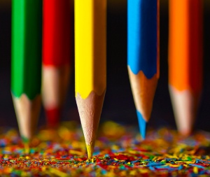
Colour
Students frequently choose their favourite colours to include in projects, rather than colours that help convey a mood. Encourage students to think about what the subject/topic makes them think about in terms of colour. Explore colour associations, such as the ones found in this infographic.
Adobe Kuler
Colour Lovers
Color Scheme Designer
Putting It All Together
Design a poster for your classroom that features a motivational quote or reminds them about a specific task. Consider the 4 elements of design we have focused on – CARP – and how you can make your poster more effective through the use of each principle.
iOS Apps for Design
Below are my favourite apps for design on the iPad.
Keynote

Keynote has a lot of flexibility in design, and has most of the features of the MacOS version. I appreciate that it has Alpha, and the grouping and ordering features are very slick. There are a number of templates to use as a starting point.
HaikuDeck
 This app is simply fabulous for students learning a presentation zen approach to slide design. There is limited information which can appear on a slide, and the template design is beautiful. The star in the crown for HaikuDeck is searching for (and attributing) creative commons licensed images from within the app – genius.
Adobe Kuler

Adobe Kuler is just geeky cool. This app is more useful for when working on a Laptop, but its features are quite spectacular on the iPad. If you open the app, a colour scheme appears from the camera app – basically, it is creating a design palette from your surroundings. You have to see it to believe it!

Phoster

Phoster is a unique app for creating posters. It has limited customisation, but a huge range of well designed templates to choose from. This is perfect for quick, professional looking posters.
 Path On

Path On is an app for adding words to pictures. Granted, there are a number of apps that do this, but where Path On adds value is that you can add text in a curved path. You draw lines for the text to follow. This allows you to be creative with where the text goes.
 Templates for Keynote

This app has wonderful infographic-style templates, which, when opened in keynote, provide you will an array of icons, images and graphs to really make your keynotes pop. One of the best apps I have found for designing keynotes on a mobile device.

AnyFont

Any design fanatic working on the iPad will at some point lament the limited number of fonts available. AnyFont helps alleviate this problem by enabling fonts to be installed on your iPad. Yes! It IS possible!
Books for Design with Kids

Molly Bang
Picture This: How Pictures Work
Mark Gonyea
A Book About Color: a Clear and Simple Guide for Young Artists
A Book About Design: Complicated Doesn’t Make it Good
Another Book About Design: Complicated Doesn’t Make it Bad
Chip Kidd
Go: A Kidd’s Guide to Graphic Design
